How local brands can look premium (without a premium budget)
By ORA
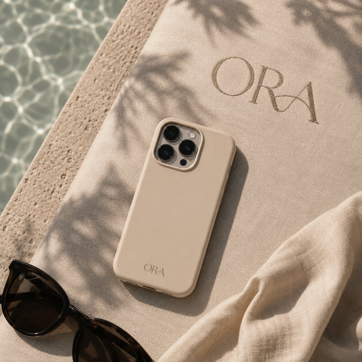
Most local businesses don't have a quality problem — they have a perception problem. The coffee is great, the treatment is excellent, the food is honest. But the brand around it whispers "cheap" when it should be saying "worth it."
The good news: perceived value is largely a design decision, and design is cheaper than ever.
Start with restraint
The fastest way to look expensive is to remove things. One typeface family, two colours, more whitespace than feels comfortable. Cluttered design reads as anxious; calm design reads as confident.
If it feels a little too empty, you're probably close to right.
Photography beats stock
A single afternoon with a decent photographer will change how customers feel about you more than a year of clip-art graphics. Real light, real people, real product. If budget is tight, one strong shoot beats ten mediocre ones.
Consistency is the multiplier
Premium brands say the same thing, the same way, everywhere — the sign, the receipt, the Instagram grid, the reply to a review. Each touchpoint that matches the others compounds trust.
- Pick your two colours and actually stick to them
- Write in one voice, even in DMs
- Template your social posts so they feel like a set
None of this requires a big budget. It requires taste and discipline — and a willingness to say no to the fifth font.
The payoff
When your brand looks considered, three things happen: customers trust you faster, they forgive small mistakes more easily, and — critically — they accept higher prices. Looking premium isn't vanity. It's margin.